Drawing Charts
Contents
Drawing Charts#
This notebook presents various options for drawing charts of data, to complement the Week 3 chart types video.
This tutorial uses concepts from both the Selection and Reshaping notebooks.
This notebook uses the “MovieLens + IMDB/RottenTomatoes” data from the HETREC data. It also uses data sets built in to Seaborn.
Setup#
First we will import our modules:
import numpy as np
import pandas as pd
import matplotlib.pyplot as plt
import seaborn as sns
Then import the HETREC MovieLens data. A few notes:
Tab-separated data
Not UTF-8 - latin-1 encoding seems to work
Missing data encoded as
\N(there’s a good chance that what we have is a PostgreSQL data dump!)
Movies#
movies = pd.read_csv('hetrec2011-ml/movies.dat', delimiter='\t', encoding='latin1', na_values=['\\N'])
movies.head()
| id | title | imdbID | spanishTitle | imdbPictureURL | year | rtID | rtAllCriticsRating | rtAllCriticsNumReviews | rtAllCriticsNumFresh | ... | rtAllCriticsScore | rtTopCriticsRating | rtTopCriticsNumReviews | rtTopCriticsNumFresh | rtTopCriticsNumRotten | rtTopCriticsScore | rtAudienceRating | rtAudienceNumRatings | rtAudienceScore | rtPictureURL | |
|---|---|---|---|---|---|---|---|---|---|---|---|---|---|---|---|---|---|---|---|---|---|
| 0 | 1 | Toy story | 114709 | Toy story (juguetes) | http://ia.media-imdb.com/images/M/MV5BMTMwNDU0... | 1995 | toy_story | 9.0 | 73.0 | 73.0 | ... | 100.0 | 8.5 | 17.0 | 17.0 | 0.0 | 100.0 | 3.7 | 102338.0 | 81.0 | http://content7.flixster.com/movie/10/93/63/10... |
| 1 | 2 | Jumanji | 113497 | Jumanji | http://ia.media-imdb.com/images/M/MV5BMzM5NjE1... | 1995 | 1068044-jumanji | 5.6 | 28.0 | 13.0 | ... | 46.0 | 5.8 | 5.0 | 2.0 | 3.0 | 40.0 | 3.2 | 44587.0 | 61.0 | http://content8.flixster.com/movie/56/79/73/56... |
| 2 | 3 | Grumpy Old Men | 107050 | Dos viejos gruñones | http://ia.media-imdb.com/images/M/MV5BMTI5MTgy... | 1993 | grumpy_old_men | 5.9 | 36.0 | 24.0 | ... | 66.0 | 7.0 | 6.0 | 5.0 | 1.0 | 83.0 | 3.2 | 10489.0 | 66.0 | http://content6.flixster.com/movie/25/60/25602... |
| 3 | 4 | Waiting to Exhale | 114885 | Esperando un respiro | http://ia.media-imdb.com/images/M/MV5BMTczMTMy... | 1995 | waiting_to_exhale | 5.6 | 25.0 | 14.0 | ... | 56.0 | 5.5 | 11.0 | 5.0 | 6.0 | 45.0 | 3.3 | 5666.0 | 79.0 | http://content9.flixster.com/movie/10/94/17/10... |
| 4 | 5 | Father of the Bride Part II | 113041 | Vuelve el padre de la novia (Ahora también abu... | http://ia.media-imdb.com/images/M/MV5BMTg1NDc2... | 1995 | father_of_the_bride_part_ii | 5.3 | 19.0 | 9.0 | ... | 47.0 | 5.4 | 5.0 | 1.0 | 4.0 | 20.0 | 3.0 | 13761.0 | 64.0 | http://content8.flixster.com/movie/25/54/25542... |
5 rows × 21 columns
movies.info()
<class 'pandas.core.frame.DataFrame'>
RangeIndex: 10197 entries, 0 to 10196
Data columns (total 21 columns):
 #   Column                  Non-Null Count  Dtype
---  ------                  --------------  -----
 0   id                      10197 non-null  int64
 1   title                   10197 non-null  object
 2   imdbID                  10197 non-null  int64
 3   spanishTitle            10197 non-null  object
 4   imdbPictureURL          10016 non-null  object
 5   year                    10197 non-null  int64
 6   rtID                    9886 non-null   object
 7   rtAllCriticsRating      9967 non-null   float64
 8   rtAllCriticsNumReviews  9967 non-null   float64
 9   rtAllCriticsNumFresh    9967 non-null   float64
 10  rtAllCriticsNumRotten   9967 non-null   float64
 11  rtAllCriticsScore       9967 non-null   float64
 12  rtTopCriticsRating      9967 non-null   float64
 13  rtTopCriticsNumReviews  9967 non-null   float64
 14  rtTopCriticsNumFresh    9967 non-null   float64
 15  rtTopCriticsNumRotten   9967 non-null   float64
 16  rtTopCriticsScore       9967 non-null   float64
 17  rtAudienceRating        9967 non-null   float64
 18  rtAudienceNumRatings    9967 non-null   float64
 19  rtAudienceScore         9967 non-null   float64
 20  rtPictureURL            9967 non-null   object
dtypes: float64(13), int64(3), object(5)
memory usage: 1.6+ MB
It’s useful to index movies by ID, so let’s just do that now.
movies = movies.set_index('id')
Movie Info#
movie_genres = pd.read_csv('hetrec2011-ml/movie_genres.dat', delimiter='\t', encoding='latin1')
movie_genres.head()
| movieID | genre | |
|---|---|---|
| 0 | 1 | Adventure |
| 1 | 1 | Animation |
| 2 | 1 | Children |
| 3 | 1 | Comedy |
| 4 | 1 | Fantasy |
movie_tags = pd.read_csv('hetrec2011-ml/movie_tags.dat', delimiter='\t', encoding='latin1')
movie_tags.head()
| movieID | tagID | tagWeight | |
|---|---|---|---|
| 0 | 1 | 7 | 1 |
| 1 | 1 | 13 | 3 |
| 2 | 1 | 25 | 3 |
| 3 | 1 | 55 | 3 |
| 4 | 1 | 60 | 1 |
tags = pd.read_csv('hetrec2011-ml/tags.dat', delimiter='\t', encoding='latin1')
tags.head()
| id | value | |
|---|---|---|
| 0 | 1 | earth |
| 1 | 2 | police |
| 2 | 3 | boxing |
| 3 | 4 | painter |
| 4 | 5 | whale |
Ratings#
ratings = pd.read_csv('hetrec2011-ml/user_ratedmovies-timestamps.dat', delimiter='\t', encoding='latin1')
ratings.head()
| userID | movieID | rating | timestamp | |
|---|---|---|---|---|
| 0 | 75 | 3 | 1.0 | 1162160236000 |
| 1 | 75 | 32 | 4.5 | 1162160624000 |
| 2 | 75 | 110 | 4.0 | 1162161008000 |
| 3 | 75 | 160 | 2.0 | 1162160212000 |
| 4 | 75 | 163 | 4.0 | 1162160970000 |
We’re going to compute movie statistics too:
movie_stats = ratings.groupby('movieID')['rating'].agg(['count', 'mean']).rename(columns={
    'mean': 'MeanRating',
    'count': 'RatingCount'
})
movie_stats.head()
| RatingCount | MeanRating | |
|---|---|---|
| movieID | ||
| 1 | 1263 | 3.735154 |
| 2 | 765 | 2.976471 |
| 3 | 252 | 2.873016 |
| 4 | 45 | 2.577778 |
| 5 | 225 | 2.753333 |
Titanic data#
We’ll also use the Titanic data set from Seaborn:
titanic = sns.load_dataset('titanic')
titanic
| survived | pclass | sex | age | sibsp | parch | fare | embarked | class | who | adult_male | deck | embark_town | alive | alone | |
|---|---|---|---|---|---|---|---|---|---|---|---|---|---|---|---|
| 0 | 0 | 3 | male | 22.0 | 1 | 0 | 7.2500 | S | Third | man | True | NaN | Southampton | no | False |
| 1 | 1 | 1 | female | 38.0 | 1 | 0 | 71.2833 | C | First | woman | False | C | Cherbourg | yes | False |
| 2 | 1 | 3 | female | 26.0 | 0 | 0 | 7.9250 | S | Third | woman | False | NaN | Southampton | yes | True |
| 3 | 1 | 1 | female | 35.0 | 1 | 0 | 53.1000 | S | First | woman | False | C | Southampton | yes | False |
| 4 | 0 | 3 | male | 35.0 | 0 | 0 | 8.0500 | S | Third | man | True | NaN | Southampton | no | True |
| ... | ... | ... | ... | ... | ... | ... | ... | ... | ... | ... | ... | ... | ... | ... | ... |
| 886 | 0 | 2 | male | 27.0 | 0 | 0 | 13.0000 | S | Second | man | True | NaN | Southampton | no | True |
| 887 | 1 | 1 | female | 19.0 | 0 | 0 | 30.0000 | S | First | woman | False | B | Southampton | yes | True |
| 888 | 0 | 3 | female | NaN | 1 | 2 | 23.4500 | S | Third | woman | False | NaN | Southampton | no | False |
| 889 | 1 | 1 | male | 26.0 | 0 | 0 | 30.0000 | C | First | man | True | C | Cherbourg | yes | True |
| 890 | 0 | 3 | male | 32.0 | 0 | 0 | 7.7500 | Q | Third | man | True | NaN | Queenstown | no | True |
891 rows × 15 columns
Bar Charts#
If we have: a categorical variable and a numeric response variable
And we want: to see how the mean of the numeric varies with the categorical
Then we can: use Seaborn catplot to create a bar chart:
sns.catplot('class', 'survived', data=titanic, kind='bar')
<seaborn.axisgrid.FacetGrid at 0x2c291b61790>
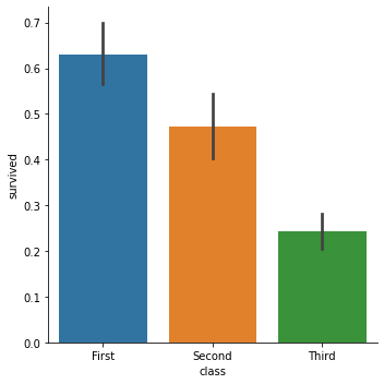
There are quite a few things going on here:
catplotby default computes the mean and 95% bootstrapped confidence intervals.If we have a 0/1 variable or a logical, such as
survived, taking its mean is the same as counting the proportion that are1orTrue; this is also the same as computing the probability of a true value. This is a very useful trick.Most (but not all) Seaborn plotting functions natively work with data frames; we give column names for the
xandyaxes, respectively, and provide the data frame asdata=, and it plots.The bars are different colors for no reason. This is annoying.
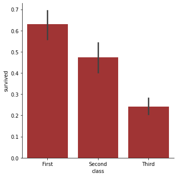
We can fix that last problem:
sns.catplot('class', 'survived', data=titanic, kind='bar', color='firebrick')
<seaborn.axisgrid.FacetGrid at 0x2c2921d81c0>
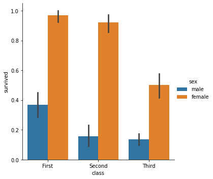
But we can also go further.
If we have: two categorical variables and a numeric response variable
And we want: to see how the mean of the numeric varies with the combination of categorical variables
Then we can: use Seaborn catplot to create a bar chart with color-coded bars by mapping a variable to hue:
sns.catplot('class', 'survived', data=titanic, kind='bar', hue='sex')
<seaborn.axisgrid.FacetGrid at 0x2c29225d6d0>
Interlude: Labeling Figures#
Seaborn calls Matplotlib under the hood, so all of Matplotlib’s functions are available to clean up our plot.
Let’s label our axes and give the chart a title:
sns.catplot('class', 'survived', data=titanic, kind='bar', hue='sex')
plt.ylabel('Survival Probability')
plt.xlabel('Passage Class')
plt.title('Survival by Class and Sex')
plt.show()
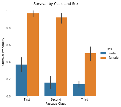
The plt.show() call tells Matplotlib to show the plot, and returns nothing, which cleans up the notebook display a bit (otherwise we also see the return value of the last plotting function, which is annoying and usually meaningless).
Scatter Plots#
If we have: two numeric variables
And we want: to plot each point in two-dimensional space based on the variable values
Then we can: use a scatter plot.
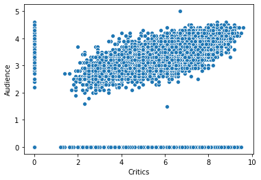
We saw this in an earlier notebook - let’s look at the relationship of Rotten Tomatoes critic and audience scores:
movie_scores = movies[['year', 'rtAllCriticsRating', 'rtAudienceRating']].rename(columns={
    'rtAllCriticsRating': 'Critics',
    'rtAudienceRating': 'Audience'
})
movie_scores
| year | Critics | Audience | |
|---|---|---|---|
| id | |||
| 1 | 1995 | 9.0 | 3.7 |
| 2 | 1995 | 5.6 | 3.2 |
| 3 | 1993 | 5.9 | 3.2 |
| 4 | 1995 | 5.6 | 3.3 |
| 5 | 1995 | 5.3 | 3.0 |
| ... | ... | ... | ... |
| 65088 | 2008 | 4.4 | 3.5 |
| 65091 | 1934 | 7.0 | 3.7 |
| 65126 | 2008 | 5.6 | 3.3 |
| 65130 | 2008 | 6.7 | 3.5 |
| 65133 | 1999 | 0.0 | 0.0 |
10197 rows × 3 columns
sns.scatterplot('Critics', 'Audience', data=movie_scores)
<matplotlib.axes._subplots.AxesSubplot at 0x2c2922dd640>
We can see more things, including distributions in the margin, with the more sophisticated jointplot:
sns.jointplot('Critics', 'Audience', data=movie_scores)
<seaborn.axisgrid.JointGrid at 0x2c2923c1550>
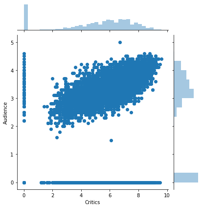
Now the top and right margins show the histograms of the those values!
Line Chart#
If we have: two numeric variables, with one that reasonably defines a ‘series’ that they progress along
And we want: to show how variables change from one value of the ‘series’ variable to another
Then we can: use a line chart.
We saw this with the average scores by year previously.
year_scores = movie_scores.groupby('year').mean()
ys_tall = year_scores.reset_index().melt(id_vars='year', var_name='Source', value_name='MeanAvgScore')
ys_tall
| year | Source | MeanAvgScore | |
|---|---|---|---|
| 0 | 1903 | Critics | 7.600000 |
| 1 | 1915 | Critics | 8.000000 |
| 2 | 1916 | Critics | 7.800000 |
| 3 | 1917 | Critics | 0.000000 |
| 4 | 1918 | Critics | 0.000000 |
| ... | ... | ... | ... |
| 191 | 2007 | Audience | 3.062162 |
| 192 | 2008 | Audience | 2.853698 |
| 193 | 2009 | Audience | 3.192308 |
| 194 | 2010 | Audience | 0.000000 |
| 195 | 2011 | Audience | 0.000000 |
196 rows × 3 columns
sns.lineplot('year', 'MeanAvgScore', hue='Source', data=ys_tall)
<matplotlib.axes._subplots.AxesSubplot at 0x2c29250e640>
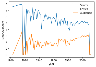
*Practice: add the mean average rating from MovieLens users to this chart.
Box Plots#
These show median-based distribution statistics for a numeric variable grouped by a categorical.
If we have: a numeric response variable and a categorical variable
And we want: to visualize median-based distribution statistics (min, max, IQR)
Then we can: use a box plot.
Let’s look at the distribution of rating counts by genre. We first need to join genres and movie stats.
mg_stats = movie_genres.join(movie_stats, on='movieID')
mg_stats
| movieID | genre | RatingCount | MeanRating | |
|---|---|---|---|---|
| 0 | 1 | Adventure | 1263.0 | 3.735154 |
| 1 | 1 | Animation | 1263.0 | 3.735154 |
| 2 | 1 | Children | 1263.0 | 3.735154 |
| 3 | 1 | Comedy | 1263.0 | 3.735154 |
| 4 | 1 | Fantasy | 1263.0 | 3.735154 |
| ... | ... | ... | ... | ... |
| 20804 | 65126 | Comedy | 2.0 | 3.250000 |
| 20805 | 65126 | Drama | 2.0 | 3.250000 |
| 20806 | 65130 | Drama | 1.0 | 2.500000 |
| 20807 | 65130 | Romance | 1.0 | 2.500000 |
| 20808 | 65133 | Comedy | 3.0 | 4.000000 |
20809 rows × 4 columns
sns.boxplot('RatingCount', 'genre', data=mg_stats)
<matplotlib.axes._subplots.AxesSubplot at 0x2c2925842e0>
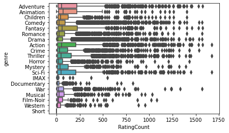
Note that this is horizontal rather than vertical - Seaborn automatically figures out which is numeric and which is categorical, and orients the box plot correctly. Horizontal is easier to have good layouts for the y axis labels.
Violin Plots#
The violin plot also shows distributions, but does so with a kernel density estimate:
sns.violinplot('MeanRating', 'genre', data=mg_stats)
<matplotlib.axes._subplots.AxesSubplot at 0x2c2923417c0>
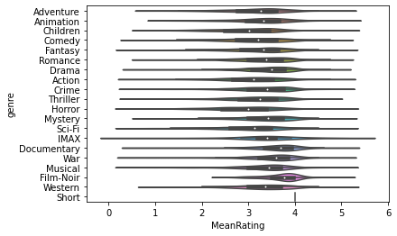
This chart is too crowded to usefully read.
Wrapping Up#
The Seaborn functions have a common interface:
xandyas first and second parameters, respectivelyif
data=points to a data frame, thenxandyare interpreted as column namescan change other aesthetics, such as color-coding points with
hue='column'
We’ll see more plot capabilities later.