Finishing Touches
Contents
Finishing Touches#
This notebook shows how to apply various finishing touches to charts to help them look better.
This notebook uses the “MovieLens + IMDB/RottenTomatoes” data from the HETREC data. It also uses data sets built in to Seaborn.
The code in this notebook will make extensive use of the matplotlib pyplot API directly, often using it to extend Seaborn-generated plots.
I will add to this notebook as more questions come up in class.
Setup#
First we will import our modules:
import numpy as np
import pandas as pd
import matplotlib.pyplot as plt
import seaborn as sns
Then import the HETREC MovieLens data. A few notes:
Tab-separated data
Not UTF-8 - latin-1 encoding seems to work
Missing data encoded as
\N(there’s a good chance that what we have is a PostgreSQL data dump!)
Movies#
movies = pd.read_csv('hetrec2011-ml/movies.dat', delimiter='\t', encoding='latin1', na_values=['\\N'])
movies.head()
| id | title | imdbID | spanishTitle | imdbPictureURL | year | rtID | rtAllCriticsRating | rtAllCriticsNumReviews | rtAllCriticsNumFresh | ... | rtAllCriticsScore | rtTopCriticsRating | rtTopCriticsNumReviews | rtTopCriticsNumFresh | rtTopCriticsNumRotten | rtTopCriticsScore | rtAudienceRating | rtAudienceNumRatings | rtAudienceScore | rtPictureURL | |
|---|---|---|---|---|---|---|---|---|---|---|---|---|---|---|---|---|---|---|---|---|---|
| 0 | 1 | Toy story | 114709 | Toy story (juguetes) | http://ia.media-imdb.com/images/M/MV5BMTMwNDU0... | 1995 | toy_story | 9.0 | 73.0 | 73.0 | ... | 100.0 | 8.5 | 17.0 | 17.0 | 0.0 | 100.0 | 3.7 | 102338.0 | 81.0 | http://content7.flixster.com/movie/10/93/63/10... |
| 1 | 2 | Jumanji | 113497 | Jumanji | http://ia.media-imdb.com/images/M/MV5BMzM5NjE1... | 1995 | 1068044-jumanji | 5.6 | 28.0 | 13.0 | ... | 46.0 | 5.8 | 5.0 | 2.0 | 3.0 | 40.0 | 3.2 | 44587.0 | 61.0 | http://content8.flixster.com/movie/56/79/73/56... |
| 2 | 3 | Grumpy Old Men | 107050 | Dos viejos gruñones | http://ia.media-imdb.com/images/M/MV5BMTI5MTgy... | 1993 | grumpy_old_men | 5.9 | 36.0 | 24.0 | ... | 66.0 | 7.0 | 6.0 | 5.0 | 1.0 | 83.0 | 3.2 | 10489.0 | 66.0 | http://content6.flixster.com/movie/25/60/25602... |
| 3 | 4 | Waiting to Exhale | 114885 | Esperando un respiro | http://ia.media-imdb.com/images/M/MV5BMTczMTMy... | 1995 | waiting_to_exhale | 5.6 | 25.0 | 14.0 | ... | 56.0 | 5.5 | 11.0 | 5.0 | 6.0 | 45.0 | 3.3 | 5666.0 | 79.0 | http://content9.flixster.com/movie/10/94/17/10... |
| 4 | 5 | Father of the Bride Part II | 113041 | Vuelve el padre de la novia (Ahora también abu... | http://ia.media-imdb.com/images/M/MV5BMTg1NDc2... | 1995 | father_of_the_bride_part_ii | 5.3 | 19.0 | 9.0 | ... | 47.0 | 5.4 | 5.0 | 1.0 | 4.0 | 20.0 | 3.0 | 13761.0 | 64.0 | http://content8.flixster.com/movie/25/54/25542... |
5 rows × 21 columns
movies.info()
<class 'pandas.core.frame.DataFrame'>
RangeIndex: 10197 entries, 0 to 10196
Data columns (total 21 columns):
 #   Column                  Non-Null Count  Dtype
---  ------                  --------------  -----
 0   id                      10197 non-null  int64
 1   title                   10197 non-null  object
 2   imdbID                  10197 non-null  int64
 3   spanishTitle            10197 non-null  object
 4   imdbPictureURL          10016 non-null  object
 5   year                    10197 non-null  int64
 6   rtID                    9886 non-null   object
 7   rtAllCriticsRating      9967 non-null   float64
 8   rtAllCriticsNumReviews  9967 non-null   float64
 9   rtAllCriticsNumFresh    9967 non-null   float64
 10  rtAllCriticsNumRotten   9967 non-null   float64
 11  rtAllCriticsScore       9967 non-null   float64
 12  rtTopCriticsRating      9967 non-null   float64
 13  rtTopCriticsNumReviews  9967 non-null   float64
 14  rtTopCriticsNumFresh    9967 non-null   float64
 15  rtTopCriticsNumRotten   9967 non-null   float64
 16  rtTopCriticsScore       9967 non-null   float64
 17  rtAudienceRating        9967 non-null   float64
 18  rtAudienceNumRatings    9967 non-null   float64
 19  rtAudienceScore         9967 non-null   float64
 20  rtPictureURL            9967 non-null   object
dtypes: float64(13), int64(3), object(5)
memory usage: 1.6+ MB
It’s useful to index movies by ID, so let’s just do that now.
movies = movies.set_index('id')
Movie Info#
movie_genres = pd.read_csv('hetrec2011-ml/movie_genres.dat', delimiter='\t', encoding='latin1')
movie_genres.head()
| movieID | genre | |
|---|---|---|
| 0 | 1 | Adventure |
| 1 | 1 | Animation |
| 2 | 1 | Children |
| 3 | 1 | Comedy |
| 4 | 1 | Fantasy |
movie_tags = pd.read_csv('hetrec2011-ml/movie_tags.dat', delimiter='\t', encoding='latin1')
movie_tags.head()
| movieID | tagID | tagWeight | |
|---|---|---|---|
| 0 | 1 | 7 | 1 |
| 1 | 1 | 13 | 3 |
| 2 | 1 | 25 | 3 |
| 3 | 1 | 55 | 3 |
| 4 | 1 | 60 | 1 |
tags = pd.read_csv('hetrec2011-ml/tags.dat', delimiter='\t', encoding='latin1')
tags.head()
| id | value | |
|---|---|---|
| 0 | 1 | earth |
| 1 | 2 | police |
| 2 | 3 | boxing |
| 3 | 4 | painter |
| 4 | 5 | whale |
Ratings#
ratings = pd.read_csv('hetrec2011-ml/user_ratedmovies-timestamps.dat', delimiter='\t', encoding='latin1')
ratings.head()
| userID | movieID | rating | timestamp | |
|---|---|---|---|---|
| 0 | 75 | 3 | 1.0 | 1162160236000 |
| 1 | 75 | 32 | 4.5 | 1162160624000 |
| 2 | 75 | 110 | 4.0 | 1162161008000 |
| 3 | 75 | 160 | 2.0 | 1162160212000 |
| 4 | 75 | 163 | 4.0 | 1162160970000 |
We’re going to compute movie statistics too:
movie_stats = ratings.groupby('movieID')['rating'].agg(['count', 'mean']).rename(columns={
    'mean': 'MeanRating',
    'count': 'RatingCount'
})
movie_stats.head()
| RatingCount | MeanRating | |
|---|---|---|
| movieID | ||
| 1 | 1263 | 3.735154 |
| 2 | 765 | 2.976471 |
| 3 | 252 | 2.873016 |
| 4 | 45 | 2.577778 |
| 5 | 225 | 2.753333 |
Seaborn data#
We’ll also use the Titanic data set from Seaborn:
titanic = sns.load_dataset('titanic')
titanic
| survived | pclass | sex | age | sibsp | parch | fare | embarked | class | who | adult_male | deck | embark_town | alive | alone | |
|---|---|---|---|---|---|---|---|---|---|---|---|---|---|---|---|
| 0 | 0 | 3 | male | 22.0 | 1 | 0 | 7.2500 | S | Third | man | True | NaN | Southampton | no | False |
| 1 | 1 | 1 | female | 38.0 | 1 | 0 | 71.2833 | C | First | woman | False | C | Cherbourg | yes | False |
| 2 | 1 | 3 | female | 26.0 | 0 | 0 | 7.9250 | S | Third | woman | False | NaN | Southampton | yes | True |
| 3 | 1 | 1 | female | 35.0 | 1 | 0 | 53.1000 | S | First | woman | False | C | Southampton | yes | False |
| 4 | 0 | 3 | male | 35.0 | 0 | 0 | 8.0500 | S | Third | man | True | NaN | Southampton | no | True |
| ... | ... | ... | ... | ... | ... | ... | ... | ... | ... | ... | ... | ... | ... | ... | ... |
| 886 | 0 | 2 | male | 27.0 | 0 | 0 | 13.0000 | S | Second | man | True | NaN | Southampton | no | True |
| 887 | 1 | 1 | female | 19.0 | 0 | 0 | 30.0000 | S | First | woman | False | B | Southampton | yes | True |
| 888 | 0 | 3 | female | NaN | 1 | 2 | 23.4500 | S | Third | woman | False | NaN | Southampton | no | False |
| 889 | 1 | 1 | male | 26.0 | 0 | 0 | 30.0000 | C | First | man | True | C | Cherbourg | yes | True |
| 890 | 0 | 3 | male | 32.0 | 0 | 0 | 7.7500 | Q | Third | man | True | NaN | Queenstown | no | True |
891 rows × 15 columns
And the Tips data:
tips = sns.load_dataset("tips")
tips
| total_bill | tip | sex | smoker | day | time | size | |
|---|---|---|---|---|---|---|---|
| 0 | 16.99 | 1.01 | Female | No | Sun | Dinner | 2 |
| 1 | 10.34 | 1.66 | Male | No | Sun | Dinner | 3 |
| 2 | 21.01 | 3.50 | Male | No | Sun | Dinner | 3 |
| 3 | 23.68 | 3.31 | Male | No | Sun | Dinner | 2 |
| 4 | 24.59 | 3.61 | Female | No | Sun | Dinner | 4 |
| ... | ... | ... | ... | ... | ... | ... | ... |
| 239 | 29.03 | 5.92 | Male | No | Sat | Dinner | 3 |
| 240 | 27.18 | 2.00 | Female | Yes | Sat | Dinner | 2 |
| 241 | 22.67 | 2.00 | Male | Yes | Sat | Dinner | 2 |
| 242 | 17.82 | 1.75 | Male | No | Sat | Dinner | 2 |
| 243 | 18.78 | 3.00 | Female | No | Thur | Dinner | 2 |
244 rows × 7 columns
Labels and Titles#
The first thing we want to do is to make sure our chart is well-labeled. Seaborn has pretty good defaults — it uses the column names, when possible — but our column names don’t always fully explain what we want to do.
For example, let’s use our basic bar chart:
sns.catplot('class', 'survived', hue='sex', data=titanic, kind='bar')
<seaborn.axisgrid.FacetGrid at 0x17a871ab760>
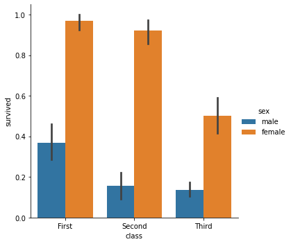
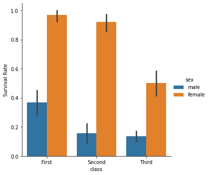
The y axis label on this chart isn’t very informative — what does “survived” mean as a numeric variable? We can relable the y axis with the ylabel function:
sns.catplot('class', 'survived', hue='sex', data=titanic, kind='bar')
plt.ylabel('Survival Rate')
Text(30.160833333333343, 0.5, 'Survival Rate')
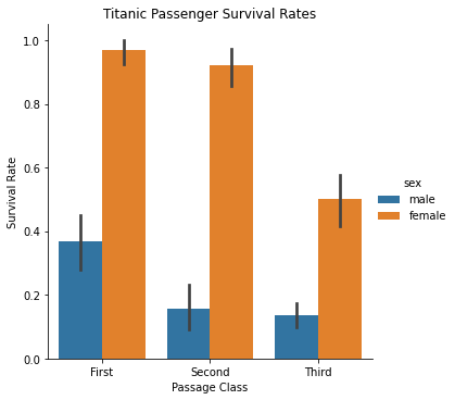
We can also clean up the x axis just a bit, and give the chart a title:
sns.catplot('class', 'survived', hue='sex', data=titanic, kind='bar')
plt.ylabel('Survival Rate')
plt.xlabel('Passage Class')
plt.title('Titanic Passenger Survival Rates')
Text(0.5, 1.0, 'Titanic Passenger Survival Rates')
Reference Lines#
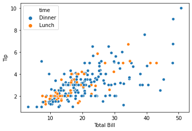
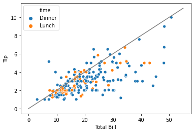
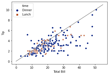
Remember our scatter plot of the tips data?
sns.scatterplot('total_bill', 'tip', hue='time', data=tips)
plt.xlabel("Total Bill")
plt.ylabel("Tip")
Text(0, 0.5, 'Tip')
What if we want to easily see how actual tips related to 20% of the bill? 20% would be represented by a line passing through \((0,0)\) with a slope of \(0.2\). The latest matplotlib version has a function to do this automatically, but it hasn’t made its way to Anaconda yet, so we’ll need to get a little manual.
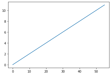
What we need to do is make a line plot of a bunch of bill values - say from 0 to some reasonable upper bound - and each value multipled by 0.2. Matplotlib is a pretty low-level interface. The numpy.linspace function lets us generate a bunch of x values:
tip20_xs = np.linspace(0, 55, 100)
Which we can multiply by 20%:
tip20_ys = tip20_xs * 0.2
We can plot a line:
plt.plot(tip20_xs, tip20_ys)
[<matplotlib.lines.Line2D at 0x17a879d96d0>]
OK, that’s good! It matches one of the colors that Seaborn will use; no worries, we can change the color.
We’re going to draw our line first, so it is behind the Seaborn dots. Let’s give it a try:
plt.plot(tip20_xs, tip20_ys, color='grey')
sns.scatterplot('total_bill', 'tip', hue='time', data=tips)
plt.xlabel("Total Bill")
plt.ylabel("Tip")
plt.show()
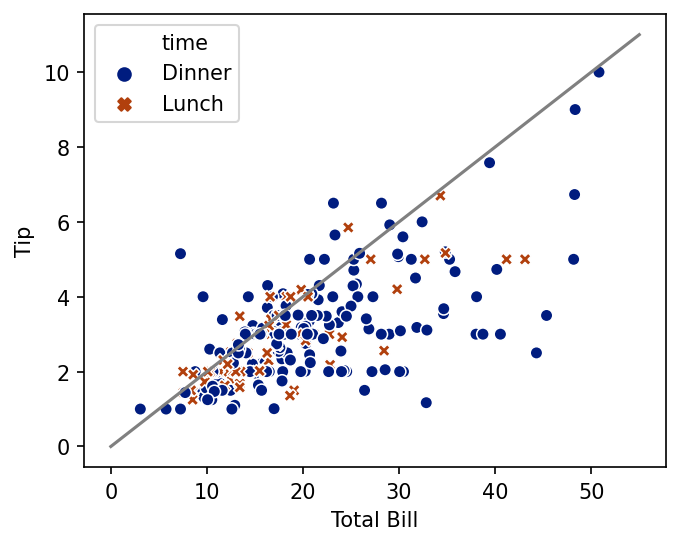
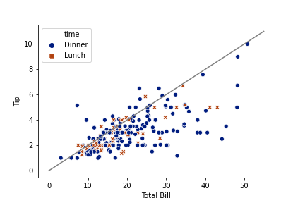
Let’s also change the markers used for the two times. This will make it easier to read the plot on e.g. a black-and-white printer. In Seaborn, we can do this with style.
Also, maybe we don’t like the colors - let’s change palettes.
plt.plot(tip20_xs, tip20_ys, color='grey')
sns.scatterplot('total_bill', 'tip', hue='time', style='time', data=tips, palette='dark')
plt.xlabel("Total Bill")
plt.ylabel("Tip")
plt.show()

In Matplotlib, the parameters for colors and styles have different names.
Controlling Size#
All these plots are using a default size and aspect ratio. What if we want to change that?
The figure call will reconfigure matplotlib for the duration of drawing the figure (until plt.show() is called):
fig = plt.figure(figsize=(5, 4), dpi=150)
plt.plot(tip20_xs, tip20_ys, color='grey')
sns.scatterplot('total_bill', 'tip', hue='time', style='time', data=tips, palette='dark')
plt.xlabel("Total Bill")
plt.ylabel("Tip")
plt.show()
Some Seaborn functions are figure-level. Such functions set up the Matplotlib figure themselves, but provide a way to control its size through the height and aspect options. height sets the height of the figure, and aspect the multiplier used to compute the width.
sns.relplot('total_bill', 'tip', hue='time', style='time', data=tips, palette='dark', height=4, aspect=1.5)
plt.xlabel("Total Bill")
plt.ylabel("Tip")
plt.show()
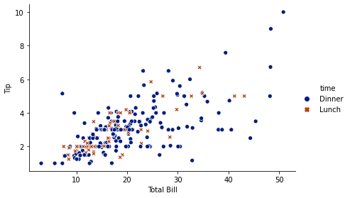
In Concluding Remarks, I say more about what “figure-level” means.
Saving to Disk#
We can save a chart to a file with savefig:
plt.plot(tip20_xs, tip20_ys, color='grey')
sns.scatterplot('total_bill', 'tip', hue='time', style='time', data=tips, palette='dark')
plt.xlabel("Total Bill")
plt.ylabel("Tip")
plt.savefig('tips.png')
That creates a file tips.png with the image; let’s load it with an HTML img tag into our document:
You can also save images to .pdf files, which is very useful for writing papers in LaTeX. The resulting figure will be entirely vector-based, so it will look good at any zoom level in your final PDF. For PNG figures used in e.g. Word, I recommend also passing dpi=300 to savefig, to render them at high resolution so they look good. I haven’t found a good vector format that is supported by Matplotlib and embeddable in Word.
If you have a figure with a very large number of points (e.g. a scaatter plot with thousands to millions of points), the resulting PDF will render each point, which will make your document very slow to render and may crash some printers. In such cases, high-DPI (at least 300) PNG is also a good option for LaTeX.
Don’t use JPEG. It will introduce visual artifacts into your figures.
Concluding Remarks#
Seaborn is basically a set of convenience APIs on top of matplotlib (and statsmodels). It is great for relatively standard chart types, and makes things like faceting far easier than core matplotlib makes them. However, since all it does is call matplotlib in a relatively straightforward fashion, you can (for the most part) freely interchange seaborn and matplotlib calls.
Some Seaborn functions are “figure-level”. Matplotlib has concepts of figures and axes; basically an Axes is one plot with x and y axes. A figure can have multiple axes on it (called subplots). Figure-level functions will take over the Matplotlib figure/axes structure, so they can do things like faceting. When a figure-level function creates multiple axes, touching up the plots with direct matplotlib calls is a little more difficult. Other Seaborn functions can actually be given the Axes to draw themselves on, in case you are managing figures and axes yourself.
A detailed discussion of matplotlib’s API design and capabilities is beyond the scope of this course. We’ll be seeing more examples (and this notebook will be expanded) as the course progresses, and I encourage you to look at the galleries and tutorials provided by seaborn and matplotlib for inspiration and instructions on more sophisticated plots.
plotnine makes assembling nuanced, polished charts quite a bit easier, abstracting over matplotlib’s capabilities with a uniform API called the Grammar of Graphics (pioneered by the R package ggplot2), but it is currently harder to install in Anaconda. I want our notebooks for this class to run out of the box in Anaconda when possible, in order to minimize software difficulties.