Drawing Charts
This notebook presents various options for drawing charts of data, to complement the Week 3 chart types video.
This tutorial uses concepts from both the Selection and Reshaping notebooks.
This notebook uses the “MovieLens + IMDB/RottenTomatoes” data from the HETREC data. It also uses data sets built in to Seaborn.
Setup
First we will import our modules:
import numpy as np
import pandas as pd
import matplotlib.pyplot as plt
import seaborn as sns
Then import the HETREC MovieLens data. A few notes:
Tab-separated data
Not UTF-8 - latin-1 encoding seems to work
Missing data encoded as
\N(there’s a good chance that what we have is a PostgreSQL data dump!)
Movies
movies = pd.read_csv('hetrec2011-ml/movies.dat', delimiter='\t', encoding='latin1', na_values=['\\N'])
movies.head()
| id | title | imdbID | spanishTitle | imdbPictureURL | year | rtID | rtAllCriticsRating | rtAllCriticsNumReviews | rtAllCriticsNumFresh | ... | rtAllCriticsScore | rtTopCriticsRating | rtTopCriticsNumReviews | rtTopCriticsNumFresh | rtTopCriticsNumRotten | rtTopCriticsScore | rtAudienceRating | rtAudienceNumRatings | rtAudienceScore | rtPictureURL | |
|---|---|---|---|---|---|---|---|---|---|---|---|---|---|---|---|---|---|---|---|---|---|
| 0 | 1 | Toy story | 114709 | Toy story (juguetes) | http://ia.media-imdb.com/images/M/MV5BMTMwNDU0... | 1995 | toy_story | 9.0 | 73.0 | 73.0 | ... | 100.0 | 8.5 | 17.0 | 17.0 | 0.0 | 100.0 | 3.7 | 102338.0 | 81.0 | http://content7.flixster.com/movie/10/93/63/10... |
| 1 | 2 | Jumanji | 113497 | Jumanji | http://ia.media-imdb.com/images/M/MV5BMzM5NjE1... | 1995 | 1068044-jumanji | 5.6 | 28.0 | 13.0 | ... | 46.0 | 5.8 | 5.0 | 2.0 | 3.0 | 40.0 | 3.2 | 44587.0 | 61.0 | http://content8.flixster.com/movie/56/79/73/56... |
| 2 | 3 | Grumpy Old Men | 107050 | Dos viejos gruñones | http://ia.media-imdb.com/images/M/MV5BMTI5MTgy... | 1993 | grumpy_old_men | 5.9 | 36.0 | 24.0 | ... | 66.0 | 7.0 | 6.0 | 5.0 | 1.0 | 83.0 | 3.2 | 10489.0 | 66.0 | http://content6.flixster.com/movie/25/60/25602... |
| 3 | 4 | Waiting to Exhale | 114885 | Esperando un respiro | http://ia.media-imdb.com/images/M/MV5BMTczMTMy... | 1995 | waiting_to_exhale | 5.6 | 25.0 | 14.0 | ... | 56.0 | 5.5 | 11.0 | 5.0 | 6.0 | 45.0 | 3.3 | 5666.0 | 79.0 | http://content9.flixster.com/movie/10/94/17/10... |
| 4 | 5 | Father of the Bride Part II | 113041 | Vuelve el padre de la novia (Ahora también abu... | http://ia.media-imdb.com/images/M/MV5BMTg1NDc2... | 1995 | father_of_the_bride_part_ii | 5.3 | 19.0 | 9.0 | ... | 47.0 | 5.4 | 5.0 | 1.0 | 4.0 | 20.0 | 3.0 | 13761.0 | 64.0 | http://content8.flixster.com/movie/25/54/25542... |
5 rows × 21 columns
movies.info()
<class 'pandas.core.frame.DataFrame'>
RangeIndex: 10197 entries, 0 to 10196
Data columns (total 21 columns):
 #   Column                  Non-Null Count  Dtype
---  ------                  --------------  -----
 0   id                      10197 non-null  int64
 1   title                   10197 non-null  object
 2   imdbID                  10197 non-null  int64
 3   spanishTitle            10197 non-null  object
 4   imdbPictureURL          10016 non-null  object
 5   year                    10197 non-null  int64
 6   rtID                    9886 non-null   object
 7   rtAllCriticsRating      9967 non-null   float64
 8   rtAllCriticsNumReviews  9967 non-null   float64
 9   rtAllCriticsNumFresh    9967 non-null   float64
 10  rtAllCriticsNumRotten   9967 non-null   float64
 11  rtAllCriticsScore       9967 non-null   float64
 12  rtTopCriticsRating      9967 non-null   float64
 13  rtTopCriticsNumReviews  9967 non-null   float64
 14  rtTopCriticsNumFresh    9967 non-null   float64
 15  rtTopCriticsNumRotten   9967 non-null   float64
 16  rtTopCriticsScore       9967 non-null   float64
 17  rtAudienceRating        9967 non-null   float64
 18  rtAudienceNumRatings    9967 non-null   float64
 19  rtAudienceScore         9967 non-null   float64
 20  rtPictureURL            9967 non-null   object
dtypes: float64(13), int64(3), object(5)
memory usage: 1.6+ MB
It’s useful to index movies by ID, so let’s just do that now.
movies = movies.set_index('id')
And extract scores:
movie_scores = movies[['rtAllCriticsRating', 'rtTopCriticsRating', 'rtAudienceRating']].rename(columns={
    'rtAllCriticsRating': 'All Critics',
    'rtTopCriticsRating': 'Top Critics',
    'rtAudienceRating': 'Audience'
})
movie_scores
| All Critics | Top Critics | Audience | |
|---|---|---|---|
| id | |||
| 1 | 9.0 | 8.5 | 3.7 |
| 2 | 5.6 | 5.8 | 3.2 |
| 3 | 5.9 | 7.0 | 3.2 |
| 4 | 5.6 | 5.5 | 3.3 |
| 5 | 5.3 | 5.4 | 3.0 |
| ... | ... | ... | ... |
| 65088 | 4.4 | 4.7 | 3.5 |
| 65091 | 7.0 | 0.0 | 3.7 |
| 65126 | 5.6 | 4.9 | 3.3 |
| 65130 | 6.7 | 6.9 | 3.5 |
| 65133 | 0.0 | 0.0 | 0.0 |
10197 rows × 3 columns
Movie Info
movie_genres = pd.read_csv('hetrec2011-ml/movie_genres.dat', delimiter='\t', encoding='latin1')
movie_genres.head()
| movieID | genre | |
|---|---|---|
| 0 | 1 | Adventure |
| 1 | 1 | Animation |
| 2 | 1 | Children |
| 3 | 1 | Comedy |
| 4 | 1 | Fantasy |
movie_tags = pd.read_csv('hetrec2011-ml/movie_tags.dat', delimiter='\t', encoding='latin1')
movie_tags.head()
| movieID | tagID | tagWeight | |
|---|---|---|---|
| 0 | 1 | 7 | 1 |
| 1 | 1 | 13 | 3 |
| 2 | 1 | 25 | 3 |
| 3 | 1 | 55 | 3 |
| 4 | 1 | 60 | 1 |
tags = pd.read_csv('hetrec2011-ml/tags.dat', delimiter='\t', encoding='latin1')
tags.head()
| id | value | |
|---|---|---|
| 0 | 1 | earth |
| 1 | 2 | police |
| 2 | 3 | boxing |
| 3 | 4 | painter |
| 4 | 5 | whale |
Ratings
ratings = pd.read_csv('hetrec2011-ml/user_ratedmovies-timestamps.dat', delimiter='\t', encoding='latin1')
ratings.head()
| userID | movieID | rating | timestamp | |
|---|---|---|---|---|
| 0 | 75 | 3 | 1.0 | 1162160236000 |
| 1 | 75 | 32 | 4.5 | 1162160624000 |
| 2 | 75 | 110 | 4.0 | 1162161008000 |
| 3 | 75 | 160 | 2.0 | 1162160212000 |
| 4 | 75 | 163 | 4.0 | 1162160970000 |
We’re going to compute movie statistics too:
movie_stats = ratings.groupby('movieID')['rating'].agg(['count', 'mean']).rename(columns={
    'mean': 'MeanRating',
    'count': 'RatingCount'
})
movie_stats.head()
| RatingCount | MeanRating | |
|---|---|---|
| movieID | ||
| 1 | 1263 | 3.735154 |
| 2 | 765 | 2.976471 |
| 3 | 252 | 2.873016 |
| 4 | 45 | 2.577778 |
| 5 | 225 | 2.753333 |
Titanic data
We’ll also use the Titanic data set from Seaborn:
titanic = sns.load_dataset('titanic')
titanic
| survived | pclass | sex | age | sibsp | parch | fare | embarked | class | who | adult_male | deck | embark_town | alive | alone | |
|---|---|---|---|---|---|---|---|---|---|---|---|---|---|---|---|
| 0 | 0 | 3 | male | 22.0 | 1 | 0 | 7.2500 | S | Third | man | True | NaN | Southampton | no | False |
| 1 | 1 | 1 | female | 38.0 | 1 | 0 | 71.2833 | C | First | woman | False | C | Cherbourg | yes | False |
| 2 | 1 | 3 | female | 26.0 | 0 | 0 | 7.9250 | S | Third | woman | False | NaN | Southampton | yes | True |
| 3 | 1 | 1 | female | 35.0 | 1 | 0 | 53.1000 | S | First | woman | False | C | Southampton | yes | False |
| 4 | 0 | 3 | male | 35.0 | 0 | 0 | 8.0500 | S | Third | man | True | NaN | Southampton | no | True |
| ... | ... | ... | ... | ... | ... | ... | ... | ... | ... | ... | ... | ... | ... | ... | ... |
| 886 | 0 | 2 | male | 27.0 | 0 | 0 | 13.0000 | S | Second | man | True | NaN | Southampton | no | True |
| 887 | 1 | 1 | female | 19.0 | 0 | 0 | 30.0000 | S | First | woman | False | B | Southampton | yes | True |
| 888 | 0 | 3 | female | NaN | 1 | 2 | 23.4500 | S | Third | woman | False | NaN | Southampton | no | False |
| 889 | 1 | 1 | male | 26.0 | 0 | 0 | 30.0000 | C | First | man | True | C | Cherbourg | yes | True |
| 890 | 0 | 3 | male | 32.0 | 0 | 0 | 7.7500 | Q | Third | man | True | NaN | Queenstown | no | True |
891 rows × 15 columns
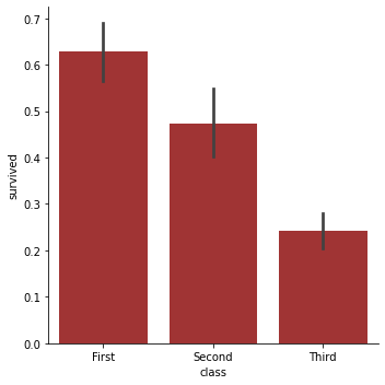
Initial Example
This is the chart for the initial example - same as from the Charting notebook:
sns.catplot('class', 'survived', data=titanic, kind='bar', color='firebrick', height=5, aspect=1)
<seaborn.axisgrid.FacetGrid at 0x228d53fb0a0>
Pseudo-3D
Psuedo-3D charts plot two explanatory variables on the x and y axes, use another means to indicate the response variable.
For this, we are going to use the RottenTomatoes all-critics and audience scores, and we want to see the joint distribution: how frequently do different combinations of critic and audience scores appear?
We’ll start with the scatter plot, just to show its clutter:
sns.scatterplot('All Critics', 'Audience', data=movie_scores)
<matplotlib.axes._subplots.AxesSubplot at 0x228d5a5d550>
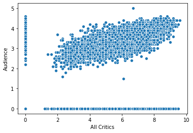
Zeros look odd here - since there are no missing values, and there’s a huge gap between zero and the first actual score, it looks more likely that zeros are missing data. Let’s treat them as such:
movie_scores[movie_scores == 0] = np.nan
movie_scores.describe()
| All Critics | Top Critics | Audience | |
|---|---|---|---|
| count | 8441.000000 | 4662.000000 | 7345.000000 |
| mean | 6.068404 | 5.930330 | 3.389258 |
| std | 1.526898 | 1.534093 | 0.454034 |
| min | 1.200000 | 1.600000 | 1.500000 |
| 25% | 5.000000 | 4.800000 | 3.100000 |
| 50% | 6.200000 | 6.100000 | 3.400000 |
| 75% | 7.200000 | 7.100000 | 3.700000 |
| max | 9.600000 | 10.000000 | 5.000000 |
Now we have missing values! The assignment did a couple of things:
Create a data frame with all logical columns, that is
Trueeverywhere a score is 0 (vectorization works in more than one dimension!)Use it as a mask, to set all values where it’s
Trueto Not a Number (Pandas’ missing-data signal)
Then we look at the description, and we see counts that indicate a lot of missing data.
We’re going to focus on all critics and audience, so let’s drop top critics, and drop all rows without values for both all critics and audience, since they will be unplottable:
ms_trimmed = movie_scores[['All Critics', 'Audience']].rename(columns={
    'All Critics': 'Critics'
}).dropna()
sns.scatterplot('Critics', 'Audience', data=ms_trimmed)
<matplotlib.axes._subplots.AxesSubplot at 0x228d5b2a6d0>
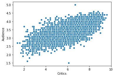
This has less funny business going on, but also is super cluttered - we see a mass, but how does the relative distribution of dots in different parts of the mass actually differ? It’s just a blob.
Contour Plot
A contour plot shows how frequent different points in a 2D space are, using contour lines (like topographic maps).
Seaborn does this with the two-parameter kdeplot. Unlike many other methods, kdeplot doesn’t know how to extract columns from data frames.
sns.kdeplot(ms_trimmed['Critics'], ms_trimmed['Audience'])
<matplotlib.axes._subplots.AxesSubplot at 0x228d5b6fa30>
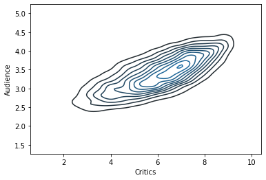
The peak is at about \((7,3.5)\).
Heat Map
Now let’s do a heat map. Seaborn heat maps require us to pre-compute the different values, and can display arbitrary statistics. The heat map actually wants a 2D data structure. So we’re going to:
Bin values - critics to whole stars, audience to half.
Critics: round
Audience: multiply by 2, round, divide by 2
Use
pivot_tableto count values in each combination of rounded audience ratings. Thepivot_tablemethod requires a value column to aggregate, so we’ll make a column filled with 1s.
ms_bins = pd.DataFrame({
    'Critics': ms_trimmed['Critics'].round(),
    'Audience': (ms_trimmed['Audience'] * 2).round() / 2
})
ms_bins
| Critics | Audience | |
|---|---|---|
| id | ||
| 1 | 9.0 | 3.5 |
| 2 | 6.0 | 3.0 |
| 3 | 6.0 | 3.0 |
| 4 | 6.0 | 3.5 |
| 5 | 5.0 | 3.0 |
| ... | ... | ... |
| 65037 | 6.0 | 4.0 |
| 65088 | 4.0 | 3.5 |
| 65091 | 7.0 | 3.5 |
| 65126 | 6.0 | 3.5 |
| 65130 | 7.0 | 3.5 |
7212 rows × 2 columns
Now we pivot, and the droplevel method gets rid of the extra level of the column index (try without it and see what happens!)
msb_counts = ms_bins.assign(v=1).pivot_table(index='Audience', columns='Critics', aggfunc='count', fill_value=0)
msb_counts = msb_counts.droplevel(0, axis=1)
msb_counts
| Critics | 1.0 | 2.0 | 3.0 | 4.0 | 5.0 | 6.0 | 7.0 | 8.0 | 9.0 | 10.0 |
|---|---|---|---|---|---|---|---|---|---|---|
| Audience | ||||||||||
| 1.5 | 0 | 1 | 0 | 0 | 0 | 1 | 0 | 0 | 0 | 0 |
| 2.0 | 0 | 12 | 17 | 6 | 1 | 0 | 0 | 0 | 0 | 0 |
| 2.5 | 1 | 50 | 118 | 205 | 110 | 39 | 7 | 1 | 0 | 0 |
| 3.0 | 0 | 21 | 157 | 477 | 616 | 672 | 257 | 41 | 0 | 0 |
| 3.5 | 0 | 4 | 29 | 135 | 361 | 882 | 883 | 400 | 26 | 0 |
| 4.0 | 0 | 0 | 1 | 18 | 50 | 215 | 472 | 625 | 156 | 1 |
| 4.5 | 0 | 0 | 0 | 0 | 1 | 4 | 20 | 58 | 59 | 1 |
| 5.0 | 0 | 0 | 0 | 0 | 0 | 0 | 1 | 0 | 0 | 0 |
sns.heatmap(msb_counts)
<matplotlib.axes._subplots.AxesSubplot at 0x228d5be1610>
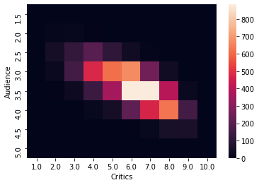
That audience axis is upside down. Let’s reverse it:
sns.heatmap(msb_counts.iloc[::-1, :])
<matplotlib.axes._subplots.AxesSubplot at 0x228d5cd06d0>
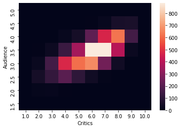
The ::-1 slice means ‘all elements in reverse order’.
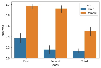
Secondary Aesthetics
We’re going to use the Titanic data again to show the survival rate by both class and sex:
sns.barplot('class', 'survived', data=titanic, hue='sex')
<matplotlib.axes._subplots.AxesSubplot at 0x228d5d71fa0>
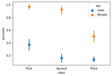
Now let’s do the same thing with a point plot:
sns.pointplot('class', 'survived', data=titanic, hue='sex', join=False)
<matplotlib.axes._subplots.AxesSubplot at 0x228d5db1dc0>
Breaking Down by More Things
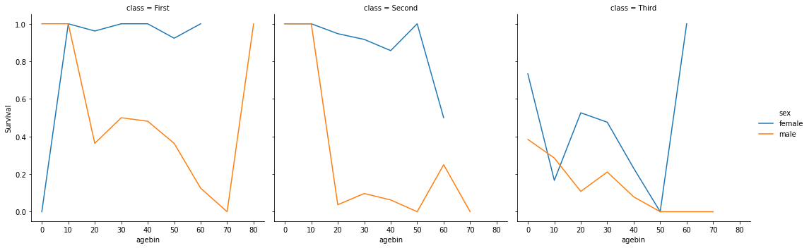
We’re going to show survival rate by:
age
sex
class
The chart look really noisy with raw age, so we’re going to bin into 10-year bands:
titanic['agebin'] = titanic['age'].round(-1)
Then we compute the rate for each point:
rate = titanic.groupby(['class', 'sex', 'agebin'], observed=True)['survived'].mean().reset_index(name='Survival')
rate
| class | sex | agebin | Survival | |
|---|---|---|---|---|
| 0 | Third | female | 0.0 | 0.733333 |
| 1 | Third | female | 10.0 | 0.166667 |
| 2 | Third | female | 20.0 | 0.526316 |
| 3 | Third | female | 30.0 | 0.476190 |
| 4 | Third | female | 40.0 | 0.230769 |
| 5 | Third | female | 50.0 | 0.000000 |
| 6 | Third | female | 60.0 | 1.000000 |
| 7 | Third | male | 0.0 | 0.384615 |
| 8 | Third | male | 10.0 | 0.285714 |
| 9 | Third | male | 20.0 | 0.107843 |
| 10 | Third | male | 30.0 | 0.211268 |
| 11 | Third | male | 40.0 | 0.078947 |
| 12 | Third | male | 50.0 | 0.000000 |
| 13 | Third | male | 60.0 | 0.000000 |
| 14 | Third | male | 70.0 | 0.000000 |
| 15 | First | female | 0.0 | 0.000000 |
| 16 | First | female | 10.0 | 1.000000 |
| 17 | First | female | 20.0 | 0.961538 |
| 18 | First | female | 30.0 | 1.000000 |
| 19 | First | female | 40.0 | 1.000000 |
| 20 | First | female | 50.0 | 0.923077 |
| 21 | First | female | 60.0 | 1.000000 |
| 22 | First | male | 0.0 | 1.000000 |
| 23 | First | male | 10.0 | 1.000000 |
| 24 | First | male | 20.0 | 0.363636 |
| 25 | First | male | 30.0 | 0.500000 |
| 26 | First | male | 40.0 | 0.481481 |
| 27 | First | male | 50.0 | 0.363636 |
| 28 | First | male | 60.0 | 0.125000 |
| 29 | First | male | 70.0 | 0.000000 |
| 30 | First | male | 80.0 | 1.000000 |
| 31 | Second | female | 0.0 | 1.000000 |
| 32 | Second | female | 10.0 | 1.000000 |
| 33 | Second | female | 20.0 | 0.947368 |
| 34 | Second | female | 30.0 | 0.916667 |
| 35 | Second | female | 40.0 | 0.857143 |
| 36 | Second | female | 50.0 | 1.000000 |
| 37 | Second | female | 60.0 | 0.500000 |
| 38 | Second | male | 0.0 | 1.000000 |
| 39 | Second | male | 10.0 | 1.000000 |
| 40 | Second | male | 20.0 | 0.037037 |
| 41 | Second | male | 30.0 | 0.096774 |
| 42 | Second | male | 40.0 | 0.062500 |
| 43 | Second | male | 50.0 | 0.000000 |
| 44 | Second | male | 60.0 | 0.250000 |
| 45 | Second | male | 70.0 | 0.000000 |
And plot:
sns.relplot('agebin', 'Survival', hue='sex', col='class', data=rate, kind='line')
<seaborn.axisgrid.FacetGrid at 0x228d5e4b4f0>